The
elements of art are a set
of techniques that describe ways
of presenting artwork. They are
combined with the
principles of art in the
production of art.
The
elements of art include: shape,
form, line, point, color, value,
texture, and space.
Shape
Shapes are not to be confused
with forms.
Forms are three-dimensional.
Shapes are two-dimensional representation
of objects.
Shapes have height and length
only.
Here are some examples of
shapes:
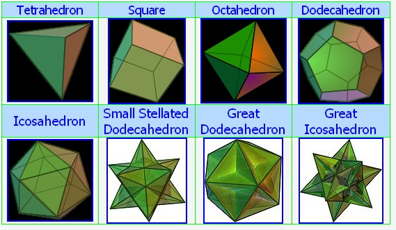
Form
Form
is the three-dimensional
counterpart to shape. There are
two types of form: Illusionary
form is created through the use
of concepts such as perspective
in order to show form on a
two-dimensional work. Real form
is the form seen in sculpture
and other three-dimensional art.
In geometry a line has no
thickness. If a line had thickness,
it would be a rectangle. No such
lines exist in nature because
they cannot be perceived.
This is not what we mean by a
line in art. In art
there are many types of lines:
Actual line:
In art a line is drawn by
pen, pencil, or other
implement. It has thickness,
length, and is a continuous mark. It may be
straight, curved, or dashed.
Contour line:
an outline, or internal
line, that defines the
shape or form of an object.
Implied or Psychic line:
This is not an actual
physical line; it's
suggested or
psychological. When pointing
at
something, the eye travels
from the hand to the object
as if on a line. This is an
example of an implied line.
How many
different lines do you see?
Collaborate:
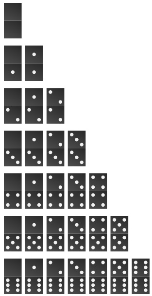
Point
A point is a pixel of color -
not to be confused with the
point in geometry. In geometry a
point has location - but no
extension. Since this notion of
a point cannot be perceived, it
has nothing to do with art.
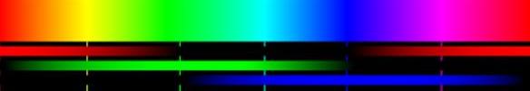
Synesthesia
is a neurological condition. The
stimulation of one sensory
pathway or cognitive pathway
leads to an involuntary
experience in a second sensory
or cognitive pathway. People who
have synesthesia are called
synesthetes. They might see
sounds, letters, and numbers as
having specific colors.
S
Y
N
E
S
T
H
E
S
I
A
0
1
2
3
4
5
6
7
8
9
Scriabin's Keyboard
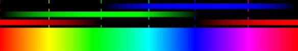
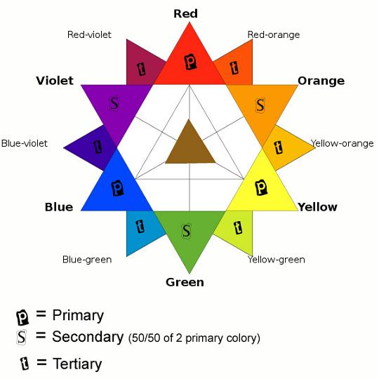
Complementary
colors are opposite on the color star.
Complementary
colors mixed 50/50 make gray.
Adding
white to a color is a tint.
Adding
black to a color is a shade.
Primary Colors
The
primary colors are red, yellow
and blue. These colors are used
to create secondary and
tertiary (intermediate) colors.
Secondary Colors
Secondary colors are made by
mixing two primary colors
together - 50/50. The secondary colors
are:
Orange - made by mixing red
and yellow
Green - made by mixing blue
and yellow
Violet - made by mixing blue
and red
Intermediate or Tertiary
Colors
Tertiary colors are made by
mixing a secondary and a primary
color together. Some examples
are blue-green and red-violet.
Warm, Cool, and Neutral
Colors
Warm
colors are the different shades
of red, yellow, and orange. They
convey the feeling of warmth.
Cool
colors are shades of blue, green,
and violet. They convey feelings of coolness and quiet.
Neutral colors are also called
earth tones. They're the
colors of
black,
white,
gray,
brown,
beige, and
tan. These colors can
be made by either mixing the
complimentary colors, all of the
primaries, or mixing black and
white.
Complementary Colors
Complementary colors are on the
opposite sides of the color
wheel. They contrast each other,
and make each other appear
brighter - adding energy to an
artwork. The complementary
colors are:
Red and Green
Yellow and Violet
Blue and Orange
Value
Sometimes combined with color,
value describes the lightness
(tint) or darkness (shade) of a
color.
Value is often the single most
important element in painting
and drawing. It is the
changing values in pictures that
make two-dimensional shapes look
like three-dimensional forms.
VALUE SCALE
Texture
Texture can be either real or
perceived. Tactile texture is
how an artwork actually feels,
while implied texture is how an
artwork appears to feel.
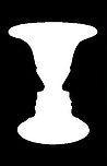
Japanese culture places a
strong emphasis on negative space.
Positive space is the space
occupied by objects. Negative
space is the area around objects, between
objects, above, below or
within objects. Space can
be described as either
two-dimensional or
three-dimensional. View
Michael
Heizer'swork.
The space in two dimensional
artworks such as paintings,
drawings, prints and photographs
(flat space) is essentially
limited to height and width.
While there is no actual depth
or distance in such works,
artists have created techniques
to create the illusion of depth
or distance on flat surfaces.
The following represents some of
those techniques:
The most prominent of these
techniques is the
application of linear
perspective. Through this
application distant objects
are rendered proportionately
smaller than closer ones.
The determining factors of
this space depends upon the
horizon line and vanishing
points.
Another of the more
prominent techniques is
known as atmospheric
perspective. This
application renders distant
objects and spaces with less
detail and intensity than
closer objects. For example,
the use of bluer colors for
distant shapes can suggest
space between the viewer and
the shapes.
The placement of objects can
give the illusion of space.
Distant shapes are higher
and closer shapes are lower
in the picture plane.
Overlapping of objects on
the picture plane can
suggest space.
Through these techniques, the
artist appears to destroy the
flatness of the picture plane,
transporting the viewer into
what appears to be a world of
actual space.
Three dimensional space is
recognized as having height,
width, depth, and is referred to
as actual space. This would
include sculpture, furniture,
architecture, ceramics and
jewelry. In the setting of a
three dimensional work of art
the viewer can freely move
around and (in the case of
architecture) through it. Three
dimensional art may use both
positive and negative space as a
means of revealing content and
meaning. For example, in
sculpture the spaces in and
around the form can be described
as negative space. Whereas the
form itself may be described as
occupying a positive space.
Another way to consider
distinctions of positive and
negative space can be equated as
the presence of physical
material = positive; or in the
absence of it = negative. The
consideration of how the artist
uses both positive and negative
space in the articulation of
their expression is an important
factor.
What elements
dominate these paintings?
Collaborate: